


The Golden Arches also looked really different.
ADVERTISEMENT
[adace-ad id=”2729″][adace-ad id=”2728″]
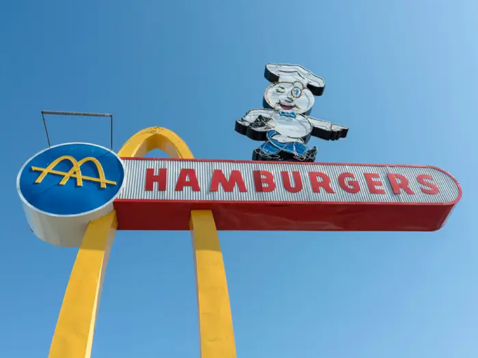
The first incarnation of McDonald’s famous “Golden Arches” logo was just a little more bizarre than most people would expect it to be. During the early 60s, the Golden Arches first took form. What was strange about this first foray into branding was that they had a strange strike through them.
Why? We aren’t sure. It almost looks like an anarchy symbol. It didn’t take too long to have a rebranding effort happen. Within a matter of years, we got a much more recognizable symbol.
ADVERTISEMENT
[adace-ad id=”2725″]
[adace-ad id=”2723″]
[adace-ad id=”2724″]